
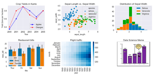
01. Matplotlib 기본 사용
 Matplotlib 라이브러리를 이용해서 그래프를 그리는 일반적인 방…
wikidocs.net
Matplotlib 특징
2. 풍부한 옵션과 유연성
레이블, 색상, 선 스타일, 마커 스타일, 글꼴 속성 등 상세한 옵션 조정이 가능하고 목적에 맞게 커스터마이징하여 데이터 시각화 가능

출력 형식

# pip install matplotlib
import matplotlib.pyplot as plt

%matplotlib inline
그래프 스타일 설정
Matplotlib은 style 기능을 통해 그래프의 전체적인 시각적 스타일을 간편하게 변경할 수 있는 기능을 제공한다. 내장된 스타일 세트를 활용해 배경, 색상 팔레트, 그리드 라인 등의 전반적인 그래프 분위기를 빠르게 변경할 수 있음
# 사용 가능한 스타일 목록 확인
for style in plt.style.available:
    print(style)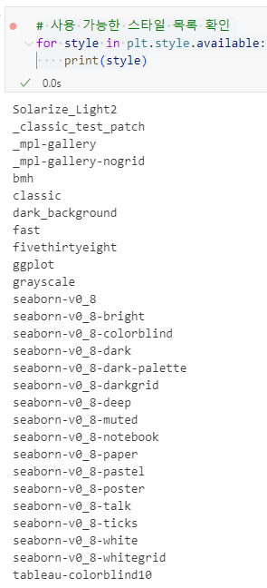
plt.style.use('ggplot')폰트 설정
# 폰트 설정 모듈 호출
from matplotlib import rcParams

# Times New Roman 폰트를 설정
rcParams['font.family'] = 'Times New Roman'

# 한글 폰트 설정
plt.rcParams['font.family'] = 'Malgun Gothic'
plt.rcParams['axes.unicode_minus'] = False  # 마이너스 깨짐 방지
그래프 저장
plt.savefig()
- Matplotlib 그래프를 이미지 파일로 저장할 때 사용한다
- 옵션:
- dpi: 이미지 해상도 (기본값 100)
- transparent: 배경 투명 여부 (True/False)
- bbox_inches: 이미지 여백 조정 ('tight' 추천)
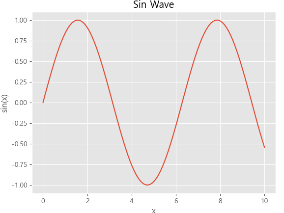
import numpy as np

# 데이터 생성
x = np.linspace(0, 10, 100)
y = np.sin(x)

# 데이터 시각화
plt.plot(x, y)
plt.title("Sin Wave")
plt.xlabel("x")
plt.ylabel("sin(x)")

# 그래프 출력
plt.show()

# 그래프 저장 (PNG 형식, 해상도 300 DPI)
plt.savefig('sin_wave.png', dpi=300, bbox_inches='tight')
주의:
plt.show() 이후에 plt.savefig()를 호출하면 그래프를 저장하지 못할 수 있다. 항상 'plt.savefig()`를 `plt.show()` 전에 호출
파일 형식:
저장되는 파일의 형식은 파일 이름의 확장자에 따라 결정됨 ( 예: .png, .jpg, .pdf, .svg 등 )
# 기본 저장
plt.savefig('plot.png')

# 고해상도 + 투명 배경 + 여백 제거
plt.savefig('plot.svg', dpi=300)

# 배경 색상 지정
plt.savefig('plot.jpg', facecolor='white', dpi=200)

# PDF 저장
plt.savefig('plot.pdf', facecolor='white', dpi=200)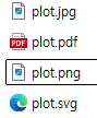
Matplotlib 그래프 생성 방식
pyplot 방식
그림(Figure)과 축(Axes)의 자동 관리 방식
- 장점:
- 간단한 그래프나 빠르게 결과를 확인할 때 가장 널리 사용됨.
- 코드가 간결해지고, 빠르게 시각화를 확인할 수 있음.
- 단점:
- 복잡한 시각화에서는 세부 옵션 설정에 제한이 있음.
- 고급 기능이나 세부적인 조정이 필요할 경우 불편할 수 있음.
import numpy as np

# 데이터 생성
x = np.linspace(0, 10, 100)

# 데이터 시각화
plt.plot(x, np.sin(x))
plt.show()
객체지향 방식
plt.subplots() 함수 사용법
- plt.subplots(): 여러 개의 서브플롯을 동시에 생성할 때 사용하여 코드를 간결하고 명확하게 작성할 수 있음.
- plt.subplots(nrows, ncols): 전체 그래프 영역(Figure)을 n행 × n열로 분할하여 서브플롯을 생성. 예를 들어, plt.subplots(1, 1)은 1행 1열로 그래프 1개를 생성.
- fig: 전체 그래프 영역을 나타내는 Figure 객체. 전체 크기나 레이아웃, 저장 등을 제어할 수 있음.
- (ax1, ax2): 각각의 서브플롯을 나타내는 Axes 객체들. ax1.plot, ax2.bar와 같이 각 서브플롯에 개별적으로 그래프를 그릴 수 있음.
# 데이터 생성
x = np.linspace(0, 10, 100)

# 1행 1열의 서브플롯 생성
fig, ax = plt.subplots(1, 1, figsize=(10, 5))

# 데이터 시각화
ax.plot(x, np.sin(x))
plt.show()
여러 개의 서브플롯 생성
1x2 그리드
# 1x2 그리드의 서브플롯 생성
fig, (ax1, ax2) = plt.subplots(1, 2, figsize=(10, 5))

# 첫 번째 서브플롯
ax1.plot(x, np.sin(x))
ax1.set_title('sin(x)')

# 두 번째 서브플롯
ax2.plot(x, np.cos(x))
ax2.set_title('cos(x)')

plt.show()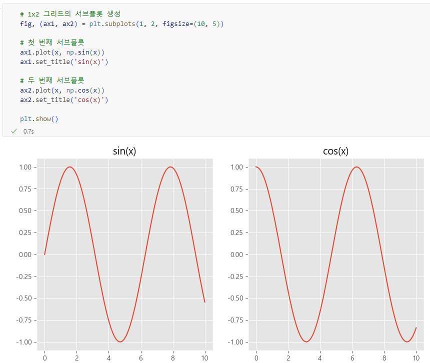
2x2 그리드
# 데이터 생성
x = np.linspace(0, 10, 100)

# 2행 2열 서브플롯 생성
fig, ((ax1, ax2), (ax3, ax4)) = plt.subplots(2, 2, figsize=(10, 8))

# 첫 번째 서브플롯
ax1.plot(x, np.sin(x))
ax1.set_title('sin(x)')
ax1.set_xlabel('x')
ax1.set_ylabel('sin(x)')

# 두 번째 서브플롯
ax2.plot(x, np.cos(x), '--')
ax2.set_title('cos(x)')
ax2.set_xlabel('x')
ax2.set_ylabel('cos(x)')

# 세 번째 서브플롯
ax3.plot(x, x)
ax3.set_title('y = x')
ax3.set_xlabel('x')
ax3.set_ylabel('y')

# 네 번째 서브플롯
ax4.plot(x, -x)
ax4.set_title('y = -x')
ax4.set_xlabel('x')
ax4.set_ylabel('y')

# 서브플롯 간 간격 자동 조정
plt.tight_layout()

plt.show()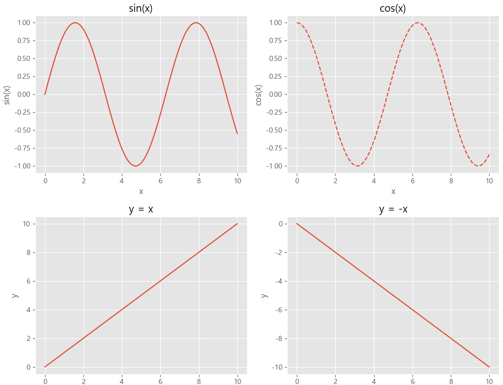
히스토그램(Histogram) 그리기
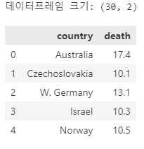
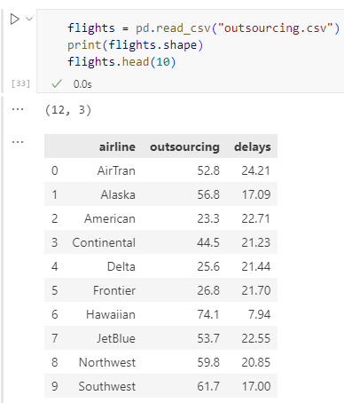
import pandas as pd

traffic = pd.read_csv("deathrates.csv")
print("데이터프레임 크기:", traffic.shape)
traffic.head()
plt.hist(traffic["death"])
plt.show()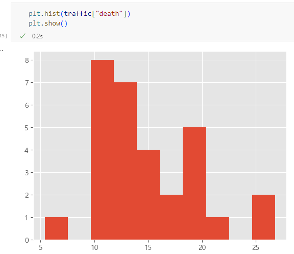
`plt.hist()` 파라미터
plt.hist(traffic["death"],
         bins=6,
         color= "lightblue",
         alpha=0.7,
         edgecolor="black",
         linewidth=0.5)

plt.show()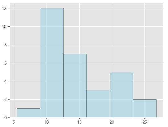
pyplot 방식
# 그래프 크기 설정
plt.figure(figsize=(8, 5))

# 히스토그램 생성성
plt.hist(traffic["death"],
         bins=6,
         color= "lightblue",
         alpha=0.9,
         edgecolor="black",
         linewidth=0.5)

# 제목, 축 레이블 설정
plt.title('Traffic Death Rates', fontsize=14, fontweight='bold', pad=20)
plt.xlabel('Death Rates', fontsize=10, labelpad=10, color='black')
plt.ylabel('Frequency', fontsize=10, labelpad=10, color='black')
plt.ylim(0, 20)

plt.show()
객체 지향 방식
# 그림(Figure) 및 축(Axes) 생성
fig, ax = plt.subplots(figsize=(8, 5))

# 히스토그램 생성
ax.hist(traffic["death"],
    bins=6,
    color="lightblue",
    alpha=0.7,
    edgecolor="black",
    linewidth=0.5)

# 제목, 축 레이블 설정
ax.set_title('Traffic Death Rates', fontsize=14, fontweight='bold', pad=20)
ax.set_xlabel('Death Rates', fontsize=10, labelpad=10, color='black')
ax.set_ylabel('Frequency', fontsize=10, labelpad=10, color='black')
ax.set_ylim(0, 20)

# 그래프 출력
plt.show()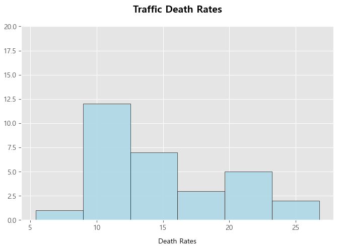
색상 추가
from matplotlib import colors

# 사용 가능한 모든 색상 이름 출력
for name, hex in colors.CSS4_COLORS.items():
print(name, hex)pop = pd.read_csv("popcities10.csv")
print(pop.shape)
pop.head(10)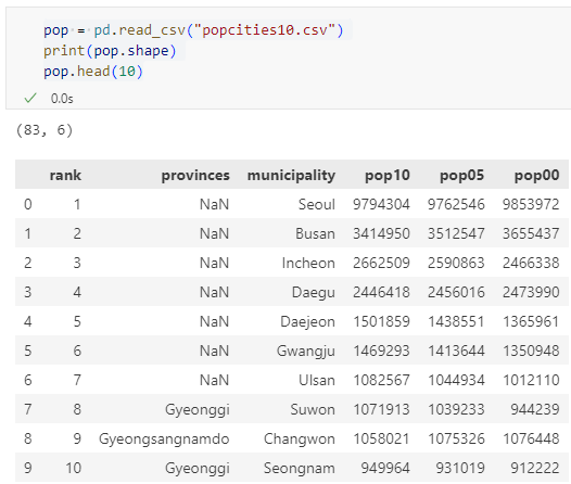
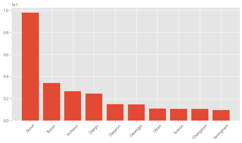
plt.bar(pop['municipality'][:10], pop['pop10'][:10])
plt.show()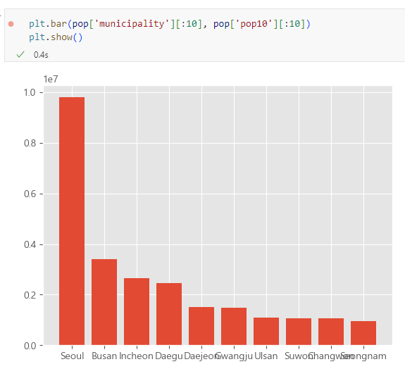
plt.figure(figsize=(10, 5))
plt.bar(pop['municipality'][:10], pop['pop10'][:10])
# plt.xticks(rotation=45) # x축 레이블 회전
plt.show()
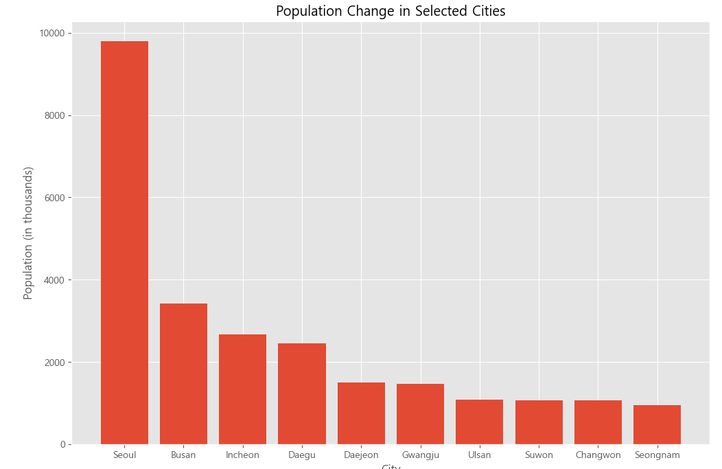
plt.figure(figsize=(12, 8))
plt.bar(pop['municipality'][:10], pop['pop10'][:10] / 1000) # 인구 단위 변환
plt.title('Population Change in Selected Cities')
plt.xlabel('City')
plt.ylabel('Population (in thousands)')
plt.show()
수평 막대 `plt.barh()`
# 그래프 크기 설정
plt.figure(figsize=(12, 8))

# 막대 그래프 생성
plt.barh(pop['municipality'][:10], pop['pop10'][:10] / 1000)

# 제목 및 축 라벨 추가
plt.title('Population Change in Selected Cities')
plt.xlabel('Population (in thousands)')
plt.ylabel('City')

plt.show()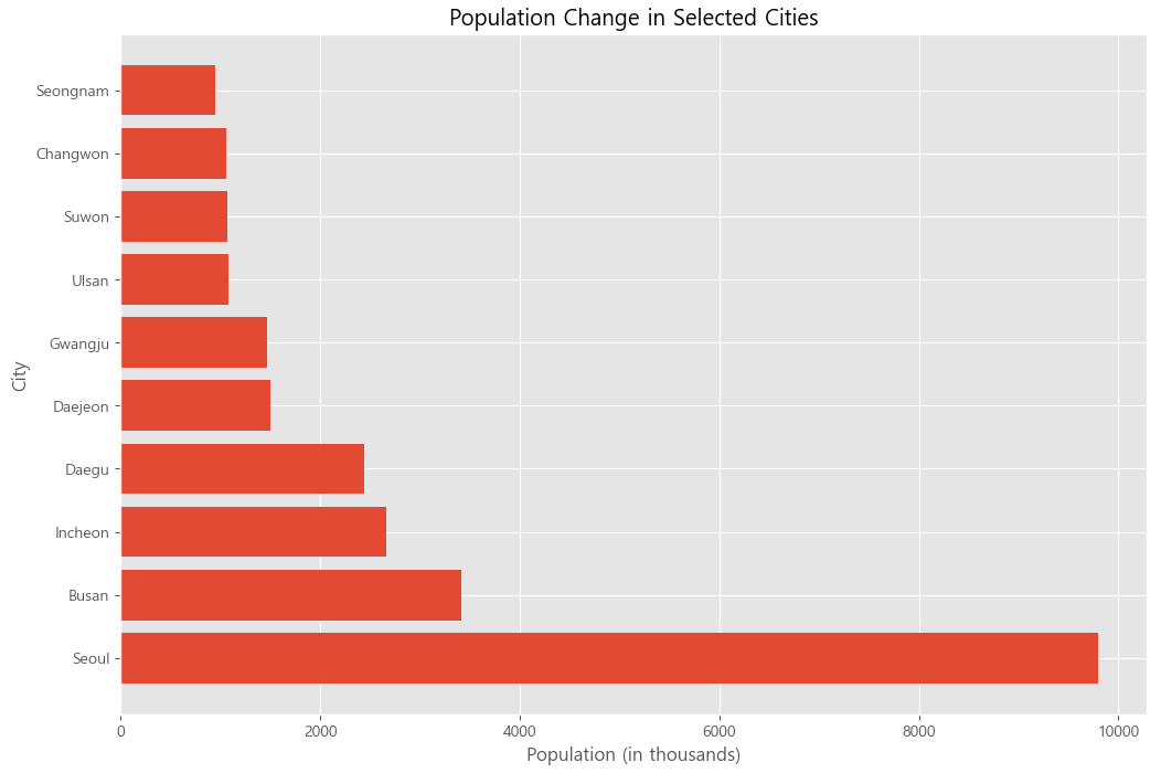
여러 막대 그리기
# 그래프 크기 설정
plt.figure(figsize=(12, 8))

# 도시 선택
selected_cities = pop['municipality'][:10]
pop_2000 = pop['pop00'][:10] / 1000
pop_2005 = pop['pop05'][:10] / 1000
pop_2010 = pop['pop10'][:10] / 1000

# X축의 위치 설정
x = np.arange(len(selected_cities))

# 막대그래프 그리기
plt.bar(x, pop_2000, width=0.2, label='2000 years')
plt.bar(x + 0.2, pop_2005, width=0.2, label='2005 years')
plt.bar(x + 0.4, pop_2010, width=0.2, label='2010 years')

# X축에 도시 이름 표시
plt.xticks(x + 0.2, selected_cities)

# 범례 표시
plt.legend()

# 제목 및 축 라벨 추가
plt.title('Population Change in Selected Cities')
plt.xlabel('Population (in thousands)')
plt.ylabel('City')

# 그래프 표시
plt.show()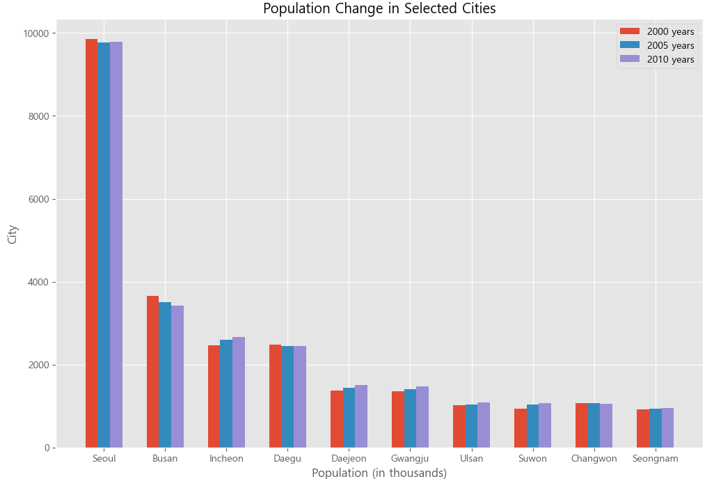
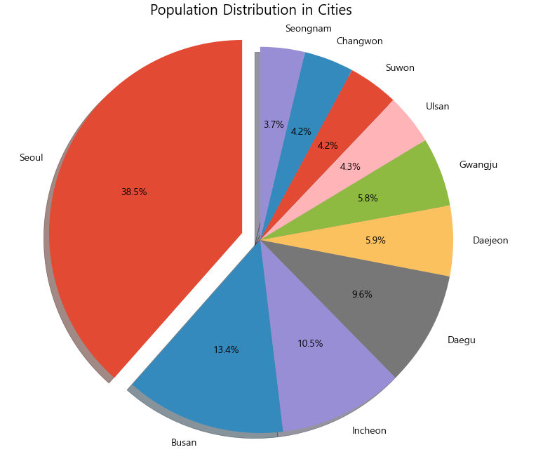
원형 그래프
plt.pie(pop['pop10'][:10], labels=pop['municipality'][:10])
plt.show()
옵션
# 그래프 크기 설정
plt.figure(figsize=(12, 8))

# 각 도시에 대해 돌출 정도 설정 (예: 첫 번째 도시만 돌출)
explode = (0.1, 0, 0, 0, 0, 0, 0, 0, 0, 0)  # 첫 번째 도시만 0.1만큼 돌출

# 원형 그래프 생성
plt.pie(pop['pop10'][:10],
        explode=explode,
        labels=pop['municipality'][:10],
        autopct='%1.1f%%',
        shadow=True,
        startangle=90)

plt.axis('equal')  # 원의 형태를 유지
plt.title('Population Distribution in Cities')
plt.show()
산점도
예시: 항공사 아웃 소싱 데이터
plt.scatter(flights["outsourcing"], flights["delays"])
plt.show()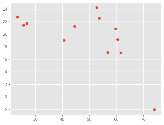
plt.scatter(flights["outsourcing"], flights["delays"], marker='o', s=30, c='g')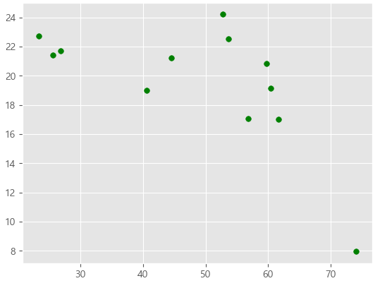
Marker reference — Matplotlib 3.10.1 documentation
Marker reference Matplotlib supports multiple categories of markers which are selected using the marker parameter of plot commands: For a list of all markers see also the matplotlib.markers documentation. For example usages see Marker examples. import matp
matplotlib.org
plt.plot() 함수를 통해 똑같이 사용 가능
plt.plot(flights["outsourcing"], flights["delays"], marker = 'x', linestyle='None') # 'o' 마커를 사용하여 점으로 표시
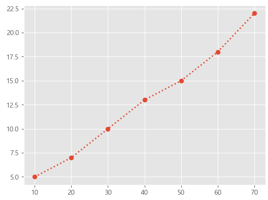
plt.show()x = [10, 20, 30, 40, 50, 60, 70]
y = [5, 7, 10, 13, 15, 18, 22]
plt.plot(x, y, marker='o', linestyle=':', linewidth=2)
plt.show()
plt.scatter(flights["outsourcing"], flights["delays"], marker='v')
plt.axhline(y=20, color='b', linestyle='--', linewidth=1)
plt.show()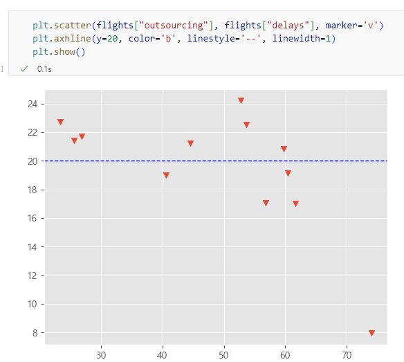
'Data Analysis > Basic' 카테고리의 다른 글
| [Data Analysis] 데이터 전처리 해보기 (0) | 2025.03.29 |
|---|---|
| [Data Analysis] 데이터 정제 및 분석 해보기 (0) | 2025.03.23 |
| [Data Analysis] Pandas 라이브러리 연습 2 (0) | 2025.03.20 |
| [Data Analysis] Pandas 라이브러리 연습 (0) | 2025.02.25 |
| [Data Analysis] 데이터 분석 프로세스 알아보기 (0) | 2025.02.19 |